Monday, August 21, 2023

Enjoy the Diner (I did)

I haven't seen much English coverage of this game except Indie Tsushin, where there's a nice overview of the game and an interview with developer Oississui (both in English and Japanese).

Enjoy the Diner grabbed me at Tokyo Game Dungeon, so I wrote this big wall of text to figure out why. Hooks and expectations, I think.

This game does some Interesting Stuff, so if you're curious, I recommend playing it before reading on because there will be spoilers. It takes 2~3 hours, and an English version released on Steam recently.

HOOKS

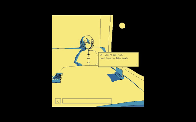
The 4-color, high-contrast, crunchy-pixels-hand-draw-with-the-MS-Paint-pencil-tool art style hooked me from across the room.

Developer Oississui posts about the making of the game on their website and on Twitter (in Japanese). The gamedev articles are refreshingly transparent, often explaining the reasoning behind design decisions, or specific works that served as inspiration.

Oississui writes that this art style not only creates a unique atmosphere, it was also very easy to work with, in terms of drawing and redrawing. Only using a few colors was an intentional choice that reduced the amount of work needed, while also contributing to the game's peculiar flavor.

This tweet reveals where the game's color palette came from.

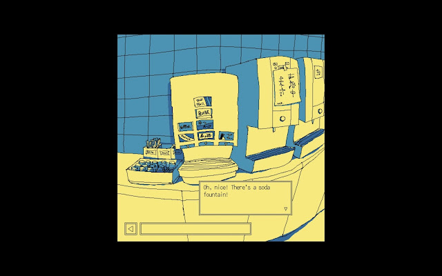
The "chatting in a midnight diner by moonlight" vibe is another hook. "Why not enjoy the diner? The moon is as full as it'll ever be, and there's even a drink fountain." 

There's a certain romance to the idea, even if you've never physically gone to Saizeriya at midnight. The game is big on atmosphere and it holds out, at least long enough for the science fiction to start unfolding.

As things get more and more sci-fi, discovering the truth about the surreal space you're trapped in becomes another hook. There's a drink bar, but aside from apple juice, most of the drinks are weird. There's a sign on the front door, but the door has no mechanism to open. There's a kitchen and a back room, but no bathroom. It's like if an alien or AI was asked to draw a restaurant, based on secondhand descriptions. Is this even a real place? This mystery drives the later half of the game through to a satisfying conclusion in the "true" ending. Questions are answered, and threads are resolved. Payoff!

EXPECTATIONS

Once the game has you in the door, it sets and manages expectations very effectively.
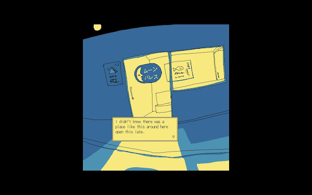
The door.

What does that mean? Every game sets expectations (explicitly or not), and tries to deliver on them. This is described as "making promises" in the article "How To Make Good Small Games", but it goes by other names. Setup and payoff, tension and release, etc.. 

Form factor is part of those expectations. Enjoy the Diner first appeared on Itch as a free version you can play in browser. It's described as a point and click adventure game with two endings, and an estimated play time of ~30 minutes. From this, I expected something like an old "Escape the Room" flash game. Easy to start, and browser games are accessible by anyone.

It turns out to be surprisingly deep for a browser game, and the actual play time will be 5 or 6 times that estimate!


Presentation also sets expectations. The game's UI is little yellow boxes, mostly out of your way at the edges of the screen. No transition animations, just jumping between screens and pop-up boxes. There is an animation for pouring a drink, but it's just a rectangle that fills up. No hand on screen, no different colors for different drinks, just a small black rectangle. Since most of the game is static images, the few animations that are present stand out as nice surprises.


Being a point and click novel game, the expected gameplay systems are pretty much set. You point, you click, and you read.

There are light puzzle decorations, but the main loop is asking characters about certain topics, and those conversations raise new topics, and those new topics are used to start new conversations, and repeat. There are a couple player choices near the end, and you can talk to characters in different orders, but there is a critical path that proceeds mostly linearly. There is a lot of dialogue, also to be expected from a novel game, and from the game's concept -- we're here forever, so might as well chit-chat and figure things out over drinks.

You also unlock a "Spot the Differences" game to pass the time, just like a real famiresu!
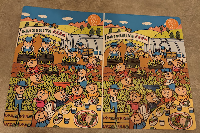
Can you find all 10?

The characters make for interesting conversation. Most lines serve a purpose, whether it's progressing the game's story, world-building, or just offering a joke. Like in Gnosia (similarly sci-fi and novel-y), the "alien" characters appear and talk and act like humans. Since they're pretty much human, they're easier for the player to like and relate to.

There aren't many shocking or dramatic onscreen moments for the characters, and everyone generally gets along. Maybe there was an opportunity to make the characters more "contrasting" in their response to being trapped in this place forever, but according to the developer's blog, the game's wholesome and easygoing approach was on purpose. It certainly stands out from other science fiction, where time and eternity are often used as vehicles for dread.


The story does have dark moments, just not usually presented through the character conversations. Some characters acted out when they initially arrived, but it's all in the past by the time the player enters. Maybe it's less wholesome if interpreted as "most characters have given up hope of escape and accepted their fate"? Resource-wise, this approach also means that different images don't need to be created for different facial expressions for each character (they never really even open their mouths in conversation).

If pressed to name one thing that didn't surpass expectations as much as others, it might be the music.

Maybe the "Spot the Differences" part is a bit tedious and pixel-hunty, but it's optional and unexpected. The music was appropriate enough, but more fine-tuning (looping management, general balance levels) could have enhanced the mood even more. The developer's blog says music was the last thing to be implemented, but as soon as it was added the atmosphere really came together, so they wish they'd started on it sooner. What's there is good, just sparse. There are stretches of time with no music, so it's nice when a familiar (or new) song starts up to break the silence.


Lastly, I've gotta talk about the box.

THE BOX

I wasn't expecting this at all. The climax of the game is when you try to open a little box with a combination lock.

If you haven't played it yet, last chance to do so and avoid spoilers below.

10 symbols, 16 digits, so that's ten quadrillion possibilities.


This moment requires commitment to the concept of "eternity" and relies on the bank of player trust the game has (hopefully) earned up to that point.

Usually when an input like this is presented to the player, the password needs to be found somewhere else. Hidden on a small scrap of paper, hinted at by another character, encoded in blood as a dying message, or something like that. Every adventure game does this. Enjoy the Diner expects this expectation and steers the player in a different direction. Talk to the other inhabitants of the restaurant, they suggest brute force. After all, you've got all the time in the world.

...

You really do have to start trying combinations one by one! 

...

Design-wise, it's a risky move but I thought it was brilliant. Reading the developer notes again, this was all according to plan, though they do acknowledge that it's "unfriendly" and some players might get stumped here.

Even once the game starts speeding through combinations automatically, this sequence does take a long time (and the extremely simple music on loop enhances this feeling). But as aeons pass, the text box chime-ins from other characters are comforting. You've spent so much time talking with each of them that you can tell who's speaking just by the text, and the whole sequence makes it feel like they're talking together in the same room, which we haven't seen at all during the regular gameplay to this point.

From there, the ending provides a nice payoff I didn't expect at all from a "30 minute" point and click browser game.


Monday, August 14, 2023

Blocky Balloons very-post-release thoughts

I made a game for Playdate! It's called "Blocky Balloons" and there's a demo, trailer, and more info at the itch.io page: https://brandooo.itch.io/blocky-balloons


That's what I should have posted about 6 months ago, when the game actually launched on February 20, 2023. If you've played it, thank you so much!

I didn't write anything sooner because I'm lazy busy, I'm not much of a marketer, and I wasn't even sure if the game would come together into a finished product. Somehow it did, and the game is even coming to Playdate's official on-device game store Catalog later this year!

This post will be a stream of scattered recollections and personal notes about the process of making the game, before I forget anything more.

Finishing the game

Like I said last year, Pulp is a great little tool and I ended up making the whole game in Pulp. I did start to stretch its limits near the end, when I was cramming in lots of polish and finishing touches. For example, I added a move undo feature. I'm glad I did, since it's a necessary QOL feature in these sokoban-likes, but at the time I wasn't sure if it was even possible in Pulp. My Playdate arrived partway through development, and the original implementation ran very slow on device. With some iteration and bulk code generation, I eventually smoothed it out.

The game has a couple little cutscenes. These also ran very slow on device at first. Originally I had each cutscene frame as a separate "room" in Pulp, since it was very easy to duplicate a room, change a few tiles, and repeat. Trying to load multiple rooms like this one after another on device performs terribly, so I had to redo them all using lots of "label" and "draw" commands. 

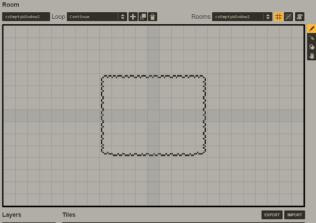
An example frame room that got cut.


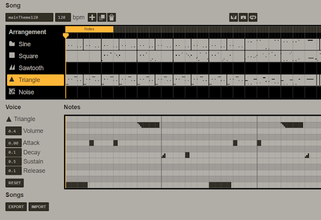
The game music and sounds also needed adjustment. Pulp uses very "pure" sine/square/sawtooth/triangle/noise waveforms, and some of these are overpowering, even distorted on the actual console at full volume. The balance of these 5 instruments also sounds different depending on how you're listening to them -- in the Pulp browser editor, in the Simulator app, on device speakers, on device with headphones, etc. So I had to listen and tweak and relisten and retweak to find a compromise. For the soundtrack download that's on the itch.io page, I ended up recording each song from the browser editor into Audacity, and exported those as mp3s to bundle into a zip file. For composing the songs, I ended up doing most of it in front of a piano with pencil and paper, jotting ideas down as I tinkered. Editing large sections of songs can be tedious in Pulp, so it's better to nail down everything as much as possible first, then punch it in.

I don't think I went above 0.5 volume for any voice in any music track. Square wave is especially tinky.


The above points suggest a note to future Brando: don't invest tons of time in something that isn't tested on the final device!

A couple other things occurred to me once I had the device in hand:

  1. It doesn't seem practical to use the D-pad and the crank at the same time. You have to hold the device steady to crank precisely, so I instinctively move my left thumb closer to the center of the device. Some games have you press B or A with your left thumb while your right hand operates the crank, and this seems to mostly work OK.
  2. The A and B buttons are placed horizontally, at a distance that's a bit far for rocking back and forth between them comfortably. They're also clicky (same for the D-pad), which is good to know exactly when an input is sent, but I don't think I'd want to repeatedly mash one for a long time. I probably won't make any hardcore action games on this thing.
  3. The crank feels sturdy, but I don't want to go crazy with it. There's a level in the Season 1 game "Crankin's Time Travel Adventure" where you have to crank as fast as possible, and after a couple timid retries I was able to beat it after going all out, but I felt nervous about damaging the crank. Some developers are making fishing games, and it might sound cool on paper to crank like mad as you reel in a big one, but in practice I hope they don't. Lucas Pope also notes here that a "light touch" feels best. This might be one of those early design stage things that people try and eventually abandon, like the joystick-rotating minigames in Mario Party.
Everyone says this, but playtesting really is necessary to get fresh eyes on your game, since you lose that perspective after spending months getting to know your project. Many changes were obvious once pointed out. I didn't change every little thing exactly as suggested, but they were all suggested for a reason, and sometimes that reason is buried in a less obvious place.

Post-launch this and that

This was my first time ever releasing a game and selling something online, and it felt strange to be on the creator's side for once. Itch.io has a nice little "Analytics" page for each project which shows me that people are downloading the game, but is anyone actually playing it? Does the zipped .pdx file I uploaded really work for everyone? What if there's some nasty bug players have encountered but haven't reported? I did my best to test the game before release, but there's no way to really know if players are playing unless they tell you.

The project analytics page from itch, at time of writing.


I started this project as a fun way to challenge myself. There are some good puzzles, but no amazing game design innovations. Selfish to say, it was more of a personal exercise to create all the pieces, put them together, and ship a complete product. I thought if even one random person out there said they enjoyed it, I'd call it a success, and that happened!

This is a niche game for a niche console, so I didn't have much financial expectations either, but the game has actually sold enough to cover the cost of the Playdate itself ($227.78 after shipping and duties), which is super cool to me. A large chunk of this came from being included in the Playdate Bunny Bundle, which was a nice community effort. Thanks a lot to @FatNoseGaming for reaching out, and the other participating developers! Bundle support is another nice feature of itch.io. Speaking of Itch, I really like the platform. It was easy for a noob like me to set up a project page, payments, downloadable files, etc. and start distributing.

I announced the game when it launched on the official Playdate discord, the dev forums, the r/playdateconsole subreddit, and Twitter. I haven't really promoted the game at all since then, except for some tweets when the Bunny Bundle campaign was going on. I could do better in terms of marketing, but that wasn't really a goal for me. Releasing a complete, finished product was a goal, and I haven't needed to push any updates in the 6 months since release, so that's great! I haven't received any bug reports, and I know at least a few people have finished the game 100%. My cynical brain did realize that in the modern world of easy minor updates, post-release patches could serve as a form of marketing. A couple bugfixes, a couple minor improvements or additions, and you've got an excuse to put the game in front of social media eyeballs for another round of exposure.

Blocky Balloons will be coming to Catalog later this year, and the new version of Playdate OS added a List View mode, so I will need to push a new update to include an icon for that at least. No promises of extra levels or other content though, my bowl of PulpScript spaghetti is large enough already!


Monday, May 9, 2022

Thoughts on Playdate’s Pulp

Playdate launched!

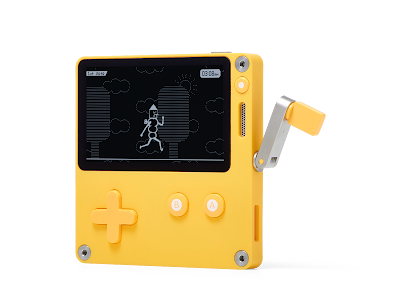
The console.

Everyone’s attention is on the tiny yellow box with the kooky crank, but I’m more excited by what Panic has provided to the developer side: free and accessible ways for people of all skill levels to make a game and play it on a real console they can hold in their hands and pass to a friend. Even if you don’t have the console, you can still play game .pdx files on the Playdate Simulator included with the SDK, on Windows/Mac/Linux. There’s also a screen mirroring application, and I could easily see myself using the physical console primarily as a controller for this, rather than playing on the device’s tiny screen once mine arrives (Group 3). The SDK and tools are free, you can distribute and sell your creations however you please, and files can easily be sideloaded onto the device or dragged and dropped like any USB volume. It’s refreshing to see a device that’s this open and “homebrew by default” released in 2022, when most other major platformers lock theirs down, take cuts of revenue, and generally do the opposite.

Panic co-founder Steven Frank talks about this philosophy here, in a note he wrote when the first Playdate orders started shipping. He also mentions “Playdate’s appeal to people who may find modern games intimidating or out of reach due to their complexity”, and says, “Learning how to write games can be easier and more inclusive than it is. Playdate’s developer tools are an order of magnitude less complex than any other current game platform I can think of. Dare I say: it’s even fun?” Which brings me to Pulp.

I’ve been meaning to give the Playdate SDK a proper try, but I just can’t stop making little prototypes in Pulp.

Pulp's room editor, showing a little digging game in the works.


Pulp is a website tool to make low- (or no-)code games in a WYSIWYG-style editor with all batteries included, inspired by bitsy. From https://play.date/dev/ , it is a “Web-based game editor for Playdate. Pixel art, chiptune music, and simple scripting built right in. It's fun!”

All of that is true, but like the quote from Steven above, emphasis on the last part -- it really is fun and delightful to use. Why?

1. Constrained design spaces. The “constraints breed creativity” philosophy applies to everything Playdate, but especially Pulp. In Pulp, the Playdate’s native resolution of 400x240 pixels is halved to 200x120, and everything is based on 8x8 tiles, so the game screen always displays a “room” of 25x15 tiles. Each pixel in a tile can be black or white (except for the player tile which can include transparent pixels). Songs have limited length and only sine, square, sawtooth, triangle, and noise waveforms to work with. Pulpscript has no compound expressions, traditional functions, local variables, or data types other than string and number. All of these constraints reduce the number of choices you have to make when designing and building a game. The result is that some game types are unviable (smoothly animating real-time action fests), but other games can be put together extremely quickly. It feels great to have an idea (within the space that Pulp allows) and be able to start building it right away, to make changes and see the effects instantly. If you use no code at all, players of your game can only walk between rooms and display messages when bumping into stationary Sprites, collecting Items, and finishing the game. Can you find a way to make a game interesting despite all those constraints? Or because of them?

Pulp's tile editor. I'm no artist, but it's fun to find ways to be expressive in an 8x8 grid.

2. Usability. As a piece of software that humans interact with, Pulp’s user interface and operations are simple and friendly. Tile and room editing icons are intuitive. Common operations have common shortcuts, for both the main editor view and the Pulpscript text editor. There are 7 color themes to choose from. After editing your game, pressing Command-B to build and play it anew only takes a second or two. In order to use Pulp you have to create an account, but this is quick (just email and password) and means that all of your work and projects are available from any browser on any computer. There’s a save button, but Pulp also routinely autosaves when editing and playing your project. There are buttons for importing and exporting the whole game, or just certain assets from it (pulp game source is just JSON). Art, code, sounds, and songs are all in one place so it’s easy to integrate them. There are feature requests for various quality-of-life improvements like multi-tile selection and tile organization options within categories (versus changing things 1 tile at a time), but when there’s a design tradeoff to be made Pulp consistently goes with the simplest, most value-for-your-mental-overhead option. No popups nag you, unless you try to run invalid Pulpscript, or your project files have changed on server since your last local edit and Pulp warns you before you overwrite something. 

3. Pulpscript is interesting. Maybe frustrating if you’ve programmed before and you’re used to being able to say “if A and B” on the same line, but interesting. The minimal syntax and limitations mentioned above mean that you can learn it all within a day or two. Documentation is clear. Again it’s obvious that keeping things simple was a priority, considering that this may be someone’s first experience with programming. Even if you have programming experience, trying to implement some feature in Pulpscript can feel like a puzzle game itself. Like #1, if anything is possible it can feel overwhelming and paralyzing, but in this restricted environment you have a more concrete starting point and a quick feedback loop to actually get something going. It becomes a fun challenge to break free and "outsmart" the restrictions, doing things in Pulp that it wasn’t originally intended for. For example, I put together a prototype for a match-3 style casual puzzle game, except it’s match-4 in a square shape. It’s on hold for now, since I don’t think the twist in design makes the game much more interesting, but maybe I’ll revisit it later. The point is that I was able to put it together in a few hours, and the process was fun. Creating different pieces using only black and white 8x8 tiles that feel visually distinct when looking at a board of them was fun. Implementing piece swapping and matching and new pieces falling in from above in Pulpscript was fun. I'm now working on a different kind of puzzle game and it's gotten to be spaghetti-codey in places, but that has steered me to keep the scope small, leading to a project that will likely get finished and released.

The match-4 prototype. Might revisit someday.

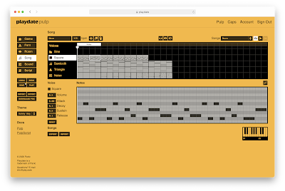
I think once you’ve decided you like a tool it’s tempting to see shortcomings as non-issues (or as features), and maybe I’ve done that a bit above. If I had to give one criticism I think the song mode is the least intuitive of the editors. Misclicks and misdrags can throw stuff off, you often have to fiddle with note octaves, and it took me a little while to figure out a good workflow (and that you have to drag the “Notes” bar to change which section of the song is shown in the piano roll view).

Pulp's song editor.

Pulp isn’t perfect, but it is extremely successful at what it aims to accomplish. It has won me over, and judging by the number of wonderful creations being shared on itch.io, the Playdate Pulp developer forums, Pulp Discord, and elsewhere, I'm not the only one. More on these creations later.

Saturday, July 3, 2021

Ten Years On The Same Macbook Pro

I've used the same Macbook Pro as my main personal computer for over 10 years now, which is a pretty long lifespan for electronic devices these days.

Still alive and well.


It's a 13-inch, early 2011 model with a 2.3 GHz i5. It came with 4 GB of RAM and a 320 GB HDD, which I later swapped out for 8 GB RAM and a 500 GB SSD, because this computer is from a time long past, when Apple let you do those kinds of upgrades yourself. I never replaced the battery, so it drains fast and the Service Battery alert has been on for years, but the machine is still fine for casual use around the house. It served me well throughout college, post-graduation work, moving to Japan, and the bumps and dings along the way.

I'm a grumpy old man when it comes to technology updates, so it was on OS X 10.9 (Mavericks) until December 2020, when I reluctantly updated for app compatibility reasons. I updated it to 10.13.6 (High Sierra), which is the furthest this old machine officially supports. That was a mistake, of course.

I traded stability and speed I was used to for general sluggishness, an annoying issue where pressing keys to wake the computer from sleep takes measurable seconds but pressing the power button wakes it instantly, and... spammy app store software update notifications, I guess?

Apps feeling slower and slower isn't a new phenomenon, but when I opened Facebook Messenger in a browser tab to send my parents a picture while video calling them at the same time, the machine really started to struggle. I bought some more RAM afterward, maxing it out at 16 GB, but that's probably going to be this machine's final upgrade.

The last surgery

EZ


I'm not sure what I'll do when this laptop croaks, but it definitely won't be replaced by a 2016~2019 model. I'm carrying a 13-inch 2017 Macbook Pro from my company, which I've been using for work almost daily since 2019. It has a 2.5 GHz i7 and 16 GB RAM so it runs macOS 10.14.6 (Mojave) fine, and it's still compatible with most apps for now.


It's lighter, and I can plug USB-C things into it, but that's about it in terms of noticeable benefits. 

Sometimes when multiple apps are open this machine slows down until I either unplug the USB hub connecting it to an external monitor, or the machine decides it needs to reboot (either suddenly by itself, or with the multilingual "You need to restart your computer" error). Sometimes it just stays on a black screen when waking up from sleep, until I'm forced to hard reboot it.

Once in a while the screen flickers a glitchy horizontal stripe of black across the screen, about 70% of the way down. It's rare but it happens, even when placed flat on a stable surface, not holding by one corner or moving the hinge or anything. That reminds me, the hinge is also really weak, compared to my 10 year old model.

This machine is wimpy from a hardware perspective in general.
  • There's only two ports on mine. I plug an Anker dongle into one of them, which gives me barely enough ports to make do with.
  • The headphone jack is on the wrong side, where right-handed mouse users want to put their external mouse.
  • The keyboard is the flat, clicky "butterfly" keyboard, which Apple has thankfully revised in newer models.
  • The left command key doesn't work on mine about 1 in 20 presses, but even without these key pressing problems (which have become common complaints and inspired an Apple repair program), this keyboard still seems to say, "Plug in an external keyboard and don't touch me."
  • I don't have big hands, but even for me there's not enough space between the bottom of the keyboard and the huge trackpad, so the bottom part of my thumb/palm which naturally falls there can cause touch detection issues. The trackpad itself works great though.
  • The arrow key shape makes the keyboard look nice and symmetric, but in practice it's hard to quickly know which key in that area your finger is on just by touch, so I ended up putting a nice textured piece of tape on the down arrow key (goodbye aesthetics).
  • My model doesn't have a touch bar, but if it did I'm sure I'd hate it.
  • The caps lock key's green light is dimmer than the one on my 2011 model and sometimes it's hard to tell if it's on or off in direct lighting.

How to make these keys usable by touch

And of course, you can't upgrade the internals yourself. That hasn't been news for a while though, it looks like users haven't been able to upgrade their Macbook's RAM since 2012 models. Still, hope you picked a decent SSD size the first time, and hope nothing breaks that requires sending it in and getting the whole board replaced (and maybe your data wiped), oh and also good luck using this machine years later when apps get even more bloated and the RAM standard needs to be raised again. "Oh but the new M1 chips!" They sound great now, since current users are indeed enjoying objectively faster computing experiences, but eventually software always eats whatever gains the hardware guys bring to the table.

Speaking of hardware, my 2011 model is slower and heavier of course, but it has some nice features which I'm going to lament here for posterity. Who knows if they'll ever be brought back.

The 2011 Macbook Pro has:
  • A MagSafe charging port, with a little indicator light so you can tell from afar if it's fully charged.
  • A physical button and indicator lights on the left side, which show you how much charge remains without having to open it up and check the screen.
  • The lit up apple logo on the top of the casing which brightens and dims along with the screen
  • The little light on the front that tells you whether the machine is on or off or sleeping
  • A variety of useful ports in general (not exactly a standout feature compared to laptops from other manufacturers)
  • A CD drive, which barely gets used nowadays but does come in handy when you buy a language-learning book that comes with an audio CD, or you want to burn a copy of a movie using HandBrake, or the sound guy from the live house you just gigged at hands you the video recording of your band on a DVD.
  • None of the keyboard problems of the newer models, it still works and feels fine to type on. Not really a pro so much as lack of a con, but a reminder that Apple can make great-feeling hardware if they want to.
Actual ports and hardware!


I also used a 2015 Macbook Pro (13-inch Retina) at my previous workplace, and that seemed like a nice middle ground between the two. Light enough without the CD drive, but still had a decent keyboard with the inverted T-shaped arrow keys, no touch bar, useful ports, and the 3.5 mm headphone jack on the correct (left) side. This model also gets a lot of love on the internet, according to certain forum commenters, many of whom say they’re still dearly holding on to theirs (or looking for one refurbished), so that’s some nice confirmation bias.

I went laptop shopping with a friend recently and we found a used 2015 Macbook Air in great shape that fit the bill (and with 8 GB RAM and 512 GB SSD) for around $400 at Janpara. The battery has some wear, but since purchase the machine has seen daily use for a few months so far with no issues. The old models still hold their value!


It does seem like Apple is easing up on the design anorexia a bit with the newer Macbooks, nice to see they backpedaled on the Touch bar models' virtual Esc key, unreliable keyboards, and went back to the inverted T arrow keys design. Maybe the next generation will be another step in the right direction, but for now, long live old hardware!

Friday, April 30, 2021

How to Unclog My Shower Room Drain

A few weeks ago the floor drain in my shower room started to have trouble draining properly. Unclogging it was quite the experience so I tweeted about it. I didn't post pictures because twitter.com is cursed enough already, but more than one sicko has asked to see them, so here you go, the full story in detail. It's gross, you've been warned. Hopefully this helps at least one other person out there make sense of the drainage system in Japanese apartment bathrooms and avoid a similar surprise.

In the past whenever my drain showed signs of getting stopped up, I poured pipe cleaner (or "pipeman") or fizzy cleaner tablets down the problem area, rinsed it after a while, and that did the trick. This time, dumping tablets and cleaner in the sink, shower, and floor drains wasn't enough. I had to go deeper.

Pipeman couldn't save me this time.

Here's what the drains look like, with some residual grossness from drain water that overflowed while I was experimenting.

Raw and unfiltered.

The floor drain trap (circle on the lower right) holds standing water. There's a grate over it, which is supposed to keep stuff from getting into the inner part with the water, which has a cylindrical plastic piece you can remove for cleaning. It's icky, but I'd pulled bits of hair and gunk out of there during routine cleanings in the past. I could see two holes on the "north" and "west" sides of the inside of the trap after taking the center cylindrical  piece out, so I got a long wire brush at the 100 yen store to poke inside them. I figured the arrangement was something like this:


I tried swishing the wire brush through both holes, but it came back clean. There was no blockage there!

I felt around the inside of the drain trap some more, confident that I'd disassembled it as much as I could. I could feel an edge around the inner "ring" of the trap, but no way to get my fingers any further.

Then, while fishing around randomly with the brush, I found another opening. A third hole, beyond the inner ring.

After pulling back the wirebrush from this hidden opening, it had some hair and soap gunk on it. Bingo. I pulled at the hair, which peeled off from around the whole ring. After a few more passes of the wirebrush, I had pulled out the following monstrosity.


Gross, but fulfilling to remove. Like clipping off a big toenail.


It actually didn't smell much, maybe due to all the pipe cleaner and orangey fresh tablets I'd put in earlier. I threw it away and ran the faucet to check.

But the drain still clogged almost just as fast as before!

I put the brush down the hidden opening again, as far as it would go, fishing out sometimes a few hairs, but not much. I jammed it in there repeatedly, trying to dig out something, anything besides frustration.

Then I landed the big one. Another big wad of scummy hair strands. They must have been plastered against the piping this whole time, dodging all past jabs of the wire brush. I kept pulling at them, getting more and more horrified as the mess kept going. This was the final boss, I could feel it. The final pile of ropey soapy slimy grimy gunkberg hair is pictured below.


Hard to tell with it all coiled up like that, but this thing had the mass of a small household pet.


It was basically a full head of hair. I could have sold this thing to a wig shop.

With the exorcism complete, I ran the faucet for a minute to verify (for real this time), threw away the demon, and went to go tell the long-haired human I live with that they're on dish duty for the next month.


TL;DR the drain arrangement is actually like this:


Sunday, April 11, 2021

Want to work at Atlus? Part 2: Job Postings


Disclaimer: I have no connection to Atlus, just taking a look as a curious surfer of the web. All pictures are from the linked recruiting pages, screenshotted early April 2021.

Job Postings

In Part 1, we looked at Atlus's recruiting site and general terms of employment for the company. So what actual skills do you need to get a job there as a programmer? A graphic designer? A planner? Let's see some job postings from the mid-career category page.


There are some application requirements common across positions:
  1. A personal CV with your photo and contact details (履歴書)
  2. A resume with your working history (職務経歴書). (Note: some places in the world just use the general term "resume", but Japanese companies separate into these two documents.)
  3. A filled out questionnaire which Atlus provides for download on the position page
  4. Certain development positions request some kind of work sample, depending on the role (see below for examples).
Let's look at specifics for a few common development positions: Programmer, Designer, and Planner.

Programmer

Responsibilities include programming the actual game software, as well as creating and upgrading various development tools, company-internal libraries, scripts and plugins for DCC tools (refers to Digital Content Creation tools, like 3ds Max, Maya, Blender).

The listing also notes that programmers at Atlus aren't limited to just programming, they're also welcome to contribute ideas and proposals in order to make the game even better.

Essential skills:

  • Programming in C, C++

Other desired skills/experience in any the following areas:

  • Work experience developing consumer RPGs/games is highly desired
  • Experience with platforms like PS4, Xbox One, Switch, Steam
  • Plugins/exporters for DCC tools
  • Shader programming (like HLSL)
  • Development experience using game engines like Unreal or Unity
  • Using middleware (like physics engines)
  • Graphics programming using OpenGL, Direct3D, etc.
  • Socket programming
  • IO programming (audio, file management, dealing with different devices, etc)

Work sample for optional submission:

A program you've created in the past. For example, an executable file and the source code, the file/code for some tool you created, some documentation or technical writing to reference, etc.

Designer

(at Atlus, this seems to be an umbrella position for many visual-related roles that might be listed separately at other companies. Looks like they call game design roles "planners", see the next section.)

Includes all aspects of visual design.
More concretely: Concept art, 3DCG (3D computer graphic) design of characters, 3DCG environments, motion design, event scenes (movies, cutscenes), effect design (like explosions, magic, rain), interface and UI design, technical designer (efficient workflows and development pipelines for HD graphics and video), riggers (technical animation, scripting, plugins).

Like the programmer posting, they note that designers at Atlus aren't limited to just graphic design work, and are encouraged to cross boundaries and share ideas to make the game even better.

Essential skills:

  • Overall:
    • Ideas and art skills necessary to clearly convey images to many other people
    • Flexible communication skills for working with many other development staff
  • 3DCG designer: Practical experience using Maya or 3ds Max
  • Motion designer: Practical experience developing motions in Maya, 3ds Max, or MotionBuilder
  • Technical designer: Experience as a 3DCG designer or motion designer, technical designer experience, and experience creating tools using scripts in various applications.
  • Interface designer: Work experience designing interfaces for games, or graphic design experience on the Web or DTP (means "Desktop Publishing", like Adobe design suite tools).

Desirable skills:

  • Overall:
    • Experience in game production
    • Experience in animation, or video direction
    • Leadership experience in the roles included in this posting
    • Experience managing the work quality and schedules of outsourcing companies
    • The ability to propose and create the production assets that are necessary for a given scenario or based on the game information that needs to be conveyed
  • Motion designer: 
    • 3DCG tool expertise, knowledge of scripting
    • Ability to create animation control rigs
  • Event scene creator: Experience creating game data using Maya or 3ds Max
  • Effect design: Ability to create hand-drawn 2D effects
  • Technical design: 
    • Specialized knowledge and technical ability related to shaders and shader programming languages
    • Knowledge and technical ability to optimize workflows and improve development.

Work sample for submission:

A portfolio (can be sketches, illustrations, 3DCG, video, anything that showcases your ability). If the submitted material is not your personal work, then please write concretely about the work you were responsible for. If it's some work that's already been published or sold, please include something that will help with understanding the content, if at all possible.

Planner

Game planners at Atlus are split into two categories: System planners mainly do things like create the game's rules, mechanics (systems) and do balance adjustments, and Scenario planners mainly draw up scenarios ("scenes" in the game, more like script or screenplay writing work).

There's a posting for system planners, one for scenario planners (experienced), and one for scenario planners (inexperienced) that's specifically for the Persona team.

The system planner posting is comparatively light on details, but that last scenario planner one sounds interesting. 


Scenario planner (no experience), for the Persona team

This role involves creating (writing) game scenarios, as well as creating the game data for things like event scenes and dialogue lines.

This listing is specifically for people with no experience producing scenarios. If you do have experience in commercial scenario creation (not limited to the gaming industry), please apply for the other "scenario planner" posting.
After joining the company, responsibilities for system and scenario planning work may change depending on your abilities and the actual situation at that time.
Also, this posting is only for the Persona team.

Essential:

  • Someone who can construct detailed worlds, characters, and scenarios (for use in a game)
  • Someone who has completed and released some kind of creative work into the world, for commercial purposes or otherwise.

Desirable:

  • Someone who can take initiative and be proactive about sharing ideas day-to-day, in order to make the game being developed more interesting.
  • Someone who has experience playing the Persona series numbered titles.

Work sample for submission:

  • 1 or 2 things you've made in the past
  • Homework task: Create a scenario starring characters from the Persona series that could be used in a game.
    • The outline/theme (1-2 pages A4 size)
    • The plot (summary) (1-5 pages, A4 size)
    • A specific scene or scenes (some key scene, like the climax or a highlight) that takes place in the work (minimum one scene)


All of the pay ranges listed for these development positions are the same as mentioned in Part 1, 213,000~440,000 yen per month, though the Director listing is a bit higher at 230,000~526,000. The two non-development positions currently listed are also higher: Project Manager is 238,000~456,000 and Music Licensing Lead (音楽ライセンス担当) is 238,000~545,000. These are just ballpark estimates though. Each listing says the range is an example, and salary will be decided based on company guidelines, taking into account the applicant's skills and experience.

They also note for all positions that everyone joins the company as contract employees, then they have the opportunity to convert to regular, full-time employees later, 0.5 ~ 3 years after joining.

At the bottom of each posting is a link to apply.


「PROJECT Re FANTASY - A Fool's Journey Begins」

Finally, the main recruiting site also has a banner linking to a separate site where they're doing "large-scale recruiting" for a new RPG, "PROJECT Re FANTASY."
 
http://rpg.jp/recruit/

Atlus's internal "Studio Zero" team is working on this totally new project, led by Persona series veterans (who've written messages on this site). There's some concept videos and artwork hinting at their vision for this new fantasy RPG. 

There's also a half-hour "Golden Recruiting Special Program" video (uploaded August 31, 2017). It's aimed at recruiting staff from the gaming industry, and has an intro and outro by Midnight Venus, from the Golden Theater (Catherine series).


The video features conversations with lead creators Katsura Hashino, Shigenori Soejima, and Shoji Meguro about this new venture, as well as some words from other Atlus staff about what it's like to work there.

As for the actual jobs on this site, they list positions for programmers, designers, and planners (and part-time designers).

*Actively* recruiting for programmers!

 Mobile game development (iOS and Android) is listed as a desired skill for programmers, so it seems this new title is coming to smartphones? The other job descriptions are mostly the same as the ones on the main site above, but aside from the part-time designer position, these postings seem geared towards more experienced applicants. The pay range for these positions is also slightly higher: all have (estimated) salary 3,250,000~6,700,000 yen yearly (so 270,833~558,333 monthly). Working conditions, terms, and other details about these employment opportunities are also mostly the same as on the main recruiting site.

There's a few other snippets of text and news on the new project site, but I'll let you discover those for yourself. If you do decide to apply, good luck!

Saturday, April 10, 2021

Want to work at Atlus? Part 1: Recruiting Site Info

Last time we looked at a translation from the Sega Tech Blog, which ended with a note that Atlus is hiring, and interested readers should check out their careers page.

What if we did that? What would it take to get a job at Atlus?

This won't be a full translation since this kind of information is very subject to change, but it will provide a snapshot of what to expect if you ever want to navigate a Japanese company's careers site and apply for a job. Enjoy it!

Disclaimer: I have no connection to Atlus, I'm just taking a look as a curious surfer of the web. All pictures are from the linked recruiting pages, screenshotted early April 2021.

https://www.atlus.co.jp/recruit/

Catherine: Full Body on the wall, Morgana to the side, but front and center under the company logo is... Jack Frost Decarabia!

Here on the home page there's a slideshow of company images, as well as a slick promo video [3.9 MB webm], [105 MB mp4].

At the top, there's a few headers which are common to most recruiting sites. The MESSAGE page has messages to potential applicants from directors and executives about the company and its goals. The ABOUT page has basic facts (name, address, date founded) about the company, and a breakdown of their different departments. Atlus's also has some neat statistics, like the number of titles they've developed and sold, the gender and age distributions of employees, average company tenure, and average amount of overtime work per month (20 hours, which is pretty low for a Japanese company, that's probably why they publish it here.)

Atlus by numbers: over 200 million total copies sold, across 239 titles released (as of October 2019).

There's also a timeline chronicling the company's history.

The History of Atlus. 1989's "Puzzle Boy" ("Kwirk" in North America) was their first title under the Atlus brand.

The PEOPLE page has links to employee profiles (no names, just job titles) introducing what their role is like. There's 13 in total, for both development positions (like designer, programmer, sound composer) and non-development positions (like corporate, sales, licensing). The profiles have interviews, games the person has worked on, example workday schedules, and short Q&A sessions.

This project manager joined Atlus in 2008. His favorite character is Aigis (from Persona 3).

Most companies have some form of the pages mentioned above on their recruiting (or リクルート、or キャリアー、or 採用) site. Atlus's SPECIAL section links to a nice photo gallery of the office space they moved to in September 2018, and to "働くパパママ座談会", a roundtable talk session between "working Mamas and Papas" about what it's like being both parents and company employees.

One of the company meeting rooms

Finally we get to the RECRUIT section, which links to a 待遇・条件 page, giving more detailed information about working conditions and terms of employment, and a Q&A page with frequently asked questions related to hiring. Let's look at the conditions page first.

https://www.atlus.co.jp/recruit/information/treatment/ on April 6, 2021

The first section notes that applicants are welcome to apply even if they don't have experience working in the game industry, but if you're not a native Japanese speaker, you need to have Japanese skills at JLPT N1 level (or equivalent). This is the same for nearly all Japanese game companies. Some companies say N2, some say N1, and some (Platinum Games) do also say "we will consider hiring highly experienced and skilled applicants who can communicate in English". But look at what else they say around that:

A couple more from other companies:

I don't think the JLPT is a very good measure of your ability to function in a native Japanese working environment, but that's a topic for a later post. The point is, if you don't know Japanese and you want to work at a Japanese company, you need to learn Japanese (many books have been written on how to do this).

Continuing down the 待遇・条件 page, there's more general employment information for mid-career and contract hires. Trial period for new employees is 6 months, base monthly salary for development positions is in the range of 213,000円~440,000円 (in USD, currently about $1927.62 ~ $3981.94), but for non-development positions the range is slightly higher. They also pay special allowances for late night overtime work, working on holidays, and commuting costs. Raises happen once a year (in April), bonuses are twice a year (June and December) and they've got some kind of "title incentive system" (maybe if the title you worked on does well you get a bigger bonus?). There's no specifics here, but as a general note, Japanese bonuses can be misleading. Sometimes it's unclear if the "bonus" is included in your estimated yearly compensation, or in addition to it. At some places, the company divides your yearly salary into 14 pieces, gives you one each month, then twice a year you get the last two pieces (depending on performance conditions), so it's not really anything extra on top of your expected yearly salary. This depends on the company, so read the fine print if possible.

Anyway, at Atlus, standard work days are 7.5 hours with 1 hour break, though exact hours can vary by position, everyone gets certain days off as well as annual paid vacation days... these kinds of details continue down the page.

Moving on to the Q&A page, which has 23 questions and answers about the application process and the working environment. 

If you aren't selected for a position, please wait at least one year before applying again to the same position. This applies for new graduate positions as well (and please refrain from applying for mid-career positions after you already applied for a new graduate position within the same year).

A lot of this page is repeat information from the previous page, or answering with policies standard for most companies, but there are a few interesting bits:
  • Overseas applicants are welcome, but they need to be able to communicate smoothly in Japanese and they will need to come to Japan for the final interview. 
  • Any information about student intern positions at Atlus will be posted on this recruiting site, or on their recruiting info Twitter account (@ATLUS_saiyo). 
  • For development-related positions, applicants can note which title or series they want to work on at the time of their application and this will be taken into consideration, but depending on suitability, they might start on a different project. Non-development positions (promotion, licensing) will work on various titles. 
  • For employee training and development, they have OJT (On-the-Job Training) for mid-career hires, and new graduates also spend a month in training with all the other new grads in Sega Group. 
  • Also, since Atlus is a part of Sega, employees can participate in other company events like SEGASAMMY College and Sega Development Conference. 


Last header: the ENTRY dropdown links to the same 4 employment categories as the recruiting homepage:
  1. 新卒採用、for new graduates (vocational school, university, graduate school). Hunting for and securing a post-graduation job is a Big Deal for Japanese university students, and this page reflects that. Usually students graduate in March, then start work in April. I'm writing this in early April, so most 2021 grads have just started work, and Atlus has already published application documents and guidelines for 2022 grads. On this page there's an example month-to-month schedule of the screening and interviewing process for different positions, and they're already accepting applications for 2022 programmer grads. There's also data from last year's new grad hires, including a monthly salary model: 2-year vocational school grads make the least (230,347円, around $2,100) and graduate school grads make the most (254,956円, around $2,325). Those numbers are for development positions (planner, designer, programmer) -- the numbers are slightly higher for non-development positions.
  2. 中途採用、for mid-career applicants (people who already have work experience). This is usually where most positions will be listed.
  3. アルバイト採用、for part-time or hourly positions. At time of writing, the only position listed here is デバッガー (debugger), basically playtesting games to find and report bugs.
  4. 障がい者採用、for people with disabilities. At time of writing, the only position listed is 一般事務アシスタント (general office assistant), an hourly position for administrative tasks.
Most Japanese companies big enough to have a dedicated recruiting website break down their employment opportunities into categories like these.

This post is getting long and we haven't even looked at any job postings yet! Those will be in Part 2 (link now updated).

Featured Post

Enjoy the Diner (I did)

I haven't seen much English coverage of this game except Indie Tsushin, where there's a nice overview of the game and an interview ...

Popular Posts